Author Photos
There’s no sense in giving advice to authors about their author photos. It’s not an editor’s job. But author photos are a part of the “package”, as they say in marketing. Author photos are right behind the title and cover as the most important visual element to selling a book. At the same time, like almost any component part in publishing, they are a small part of process that are probably inconsequential to the general success of a book but that is endlessly fun to pick over, examine, and compare. So let’s do that.
The Golden Rule of Author Photos
Here is the golden rule: The author should look like they’ve written the book you’re holding.
This summarizes the sum total of the advice for any author and what makes it a golden rule is that it is equally applicable across genres. The author of a funny book should look like they’re up to no good, a serious novelist shouldn’t crack a smile, a cozy murder mystery writer should look dusty, and so on.
It has often been remarked that reading a good book can be like falling under a magical spell. That’s what it feels like anyway, when an author has total command and the book is working. But sometimes, even with a great book, you remember you’re reading a book and start to look at the back cover or on the back flap in search of its writer. It’s important that when a reader does this, that they find an author who reflects back the tone of the book. In other words, it keeps the magic spell alive. If there was a goofy picture of Leo Tolstoy on the back of War and Peace, it might undermine the whole proceeding. Guess what? There are no silly pictures of Leo Tolstoy in part because it was the 19th century, in part because Tolstoy understood the assignment and always looked the part of a man who would write timeless literature of enormous depths.
When Author Photos Go Right
It seems Donna Tartt might also be the golden rule unto herself: if you’re looking for an author that every element of publishing has worked for, it’s Tartt. So, no surprise, she’s also the paragon of the perfect author photo. In fact, when the famous photographer Beowulf Sheehan (he has photographed various heads of state, Oprah, Scorsese, etc.) put out a book exclusively of writer portraits it was Donna Tartt’s author photo that he put on the cover. And just like how many young writers have tried to copy Tartt’s debut novel The Secret History, many have also tried and failed to capture her essence of authoritative, air-splitting, sense of cool (Joan Didion is the obvious predecessor of this type of author photo, but Tartt gets extra points for doing it without the cool cheat code of a cigarette in her hand).
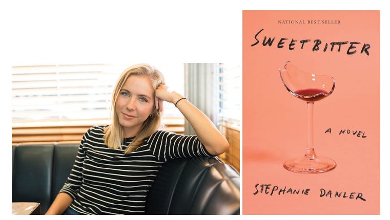
Another good modern example of an author photo that works in total lock-step with the publishing of the book is Stephanie Danler’s Sweetbitter. Danler’s debut novel about coming to New York City and the coming-of-age drama of working in an upscale Manhattan restaurant is highly autobiographical. Danler’s personal experience was part of how the novel was sold, what she was interviewed about, and so naturally, even more so than usual (and justifiably so in this instance) readers are going to think the main character is a stand-in for the author. This makes the author photo more important than ever, and Danler nailed it. Not that it’s hard to evoke a character that is based on herself, but the restaurant booth is a nice, subtle background to remind you she’s of (or was) of the world which the novel is as much about as its protagonist.
When Author Photos Go Wrong
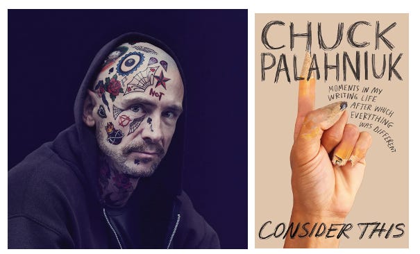
In Danler’s case and many others, it’s easier to get the author photo right, or at least directionally right—you just have to go with the grain. In a culture that is more self-centered by the day, it is most likely for readers to already assume that the writer and the characters they are writing are one in the same. So, what happens when you want to go against the expectations of a reader with the author photo? Many authors put their observations of people, not of themselves, into their novels. Many authors relish in writing about people who explicitly aren’t them in many ways. Well, the fact is that it is much harder to push against expectations than go with them. Take Chuck Palahniuk’s author photo from Consider This, his nonfiction book on writing:
It’s a real doozy. Really, it’s a joke that pokes fun at how people see Chuck Palahniuk based on his books. In fact, in Consider This an incredibly good book on how to write that also serves somewhat as a memoir, Chuck talks candidly about how readers often conflate his characters with him as a person. Most often, they think the guy who wrote Fight Club and other twisted fiction is a sicko misogynist. What’s incredible about Consider This is not only its invaluable advice and deconstruction of how Palahniuk’s writing and storytelling works, but it also reveals a rather tender and sensitive person. Between the covers, the book could have been a chance to radically change or push back against many reader’s views, but with the author photo he chose to encourage the blurring of the line. The golden rule of author photos of course still applies here, and this unfortunately did not look like the same person who had written the wise, thoughtful, book that is Consider This.


A much considered topic by authors, and the best advice I’ve heard on the subject. In the UK and Ireland, crime writers have their picture taken in front of a brick wall. No one knows why but this was the law for a while. When it comes to male literary writers in Ireland there is a certain style hierarchy - if you once won a prize you can wear a very long and extremely thin scarf. Nobody knows where these scarves are purchased as you never see them on sale anywhere. For a while I thought the Arts Council handed them out. If the male literary writer won a prize and has written a bestseller they can wear a big hat. Any Irish writer wearing both the thin scarf and the big hat is to be avoided at all costs as they are clearly mad.
Really funny and helpful!! I've been putting off having my author photo taken because I wanted to be a cool girl Asian Donna Tartt, but you've helped be realise that the brief should be slightly chaotic lady detective, and that's 100% my actual style!